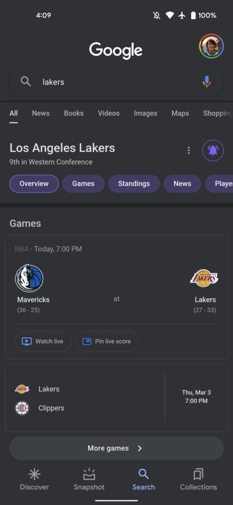
Google is testing a darker dark mode for its Android Search app, which is not the same as the one they were testing last month on desktops.
According to The Verge, the one spotted in the mobile app is darker than the usual dark grey but still lighter than pitch black. This change primarily applies to the background of Google Discover and instead of light grey (#202124), the dark theme is now closer to black (#171717) with everything, especially the Google logo, contrasting more, according to 9TO5Google.
9TO5Google reports that there are similar changes at the top of the search results page, however, the list of links has not been changed in any way, and there are no changes to the Assistant Snapshot.
It is not clear if Google will make changes to the entire company and make everything darker or if these changes only apply to Google Search.
The tweaked dark theme is not yet available worldwide, but it is currently live as a beta version on Google’s beta channel.
Google confirmed last year that it was testing dark mode on desktops and that it would start rolling out in February this year, according to an article by The Verge.
“We’re always testing new ways to improve our experience for our users, but don’t have anything specific to announce right now,” Google had told The Verge last year in a statement.
Twitter and Microsoft, prominent tech companies, also went darker last year to catch up on an even darker theme bandwagon. Microsoft was testing changes to Word to make entire documents dark when you’re using dark mode, and Twitter.
The Verge also speculated that the new dark mode theme will save battery life for people who have OLED displays, who just prefer to have a dark mode theme. Android users who want to test the feature have to go to Google Play and download APKMirror.
This is how the new theme and the old theme look in comparison:
Old theme:

New theme:

By Zintle Nkohla
Follow Zintle Nkohla
Follow IT News Africa